
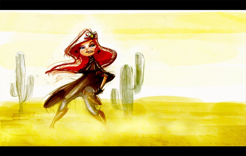
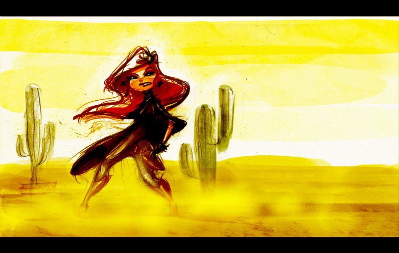
A look into just how indecisive I am. A rough sketch and some color to play with technique and mood... The differences are very subtle. Some differences in intesity of color mostly. I just like some things from each one...
I need to stop screwing around and just draw...


Look! Up in The Sky!
10 years ago

9 comments:
I think the second one of the color concepts nails it pretty well. The top is too dull for my taste - but I do saturate everything - don't I?
The third looks like you took the second and layered a dupe on it. Still looks good though - the third was the first one I looked at.
On top of all that, the sketch is great - I wish I could get that kind of action pose. The way the hair is implied to be whipping around really sells it for me.
Grade A!
Dave
Personally I like the first one the best.
I'm glad you posted these. It seems like we have simmillar working methods.I find the exploratory possibilities fun.(However i do realise exploring can be endless if your not carefull.)
For my tastes,...i love the 1st approach.It seems a departure from the types of colors you normally choose.I can also taste the dirt.
Looking at it again,...i LOVE the 1st approach.Great.
i can taste the dirt in the first one (great way to state it kevin) but i can feel the heat in the 3rd...depends on the mood and what you want us to feel really...so what is it that you are trying to make me feel...other than guilt, and shame and...oh, er um...i'll talk to you later about that...
nice, man
j
Nice stuffs!! love the character design ... great gesture
The top one. I feel it. I like saturated colors in the others (number 3 is my second choice for that over exposed loook) but the washed out colors feels like the desert to me.
Maybe her colors could pop more and lend some contrast against the background? It does feel balanced now though.
Those layer effects in Photoshop are time sucks. I could play with those all day layering colors and whatnot.
"The freekin' 'rican" stikes again! Great stuff Javi!
I like the first one the best. I think you should steer away from 255 because being subtle always tends to look good.
But anyway---> they all look good, no question.
Very cool!!!
Post a Comment