 Artwork © 2005-2006 Javier Guzman
 Here they are...
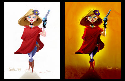
Two variations to finalize the whole process...
the one on the left is pretty straight forward where as the lighting on the right, i think, seems to be a bit more situational... I always run into problems during this process, because usually its tough for me to make up my mind (or I get a bit carried away).
Thanks to Bruno Werneck for giving me the idea to post both of these!
Luckily I was able to only waste 1 day during this process. Thats a step up for me ;)
P.S. Sorry, Quality is a bit low.


4 comments:
Looks good Javi. Hard to say which is a favorite. I guess thats the problem with us being digital these days. So many possible variations.
I wish you had kept that great stylized sun from the sketch. It was a cool design.
jav
this is a great design...i actually prefer the flat TRES version...sometimes shading distracts from the whole design...but sho is beautiful, man...
joe
Joe, I deffinately know what youre saying...
I think for animation purposes I would much rather go with something like the flat color version...
I'm in the middle of trying out a few things in photoshop and I'm having a blast so I couldnt make up my mind....
These are magnificent Jav! Thanks for posting the entire process. I always enjoy seeing how others work, it's a great way to learn for oneself.
Post a Comment